This week the International Panel on Climate Change released the synthesis report for its sixth assessment. It is all about the existential questions of our time: what is happening now, what does the future hold, and what should be done about it? This report is the last before 2030 – something of a final warning – and brings together the IPCC’s work over past assessments. At only 36 pages, the summary for policy makers is more approachable than the full reports that underpin each assessment. But in case you’re short on time, here are five graphics that capture messages the humanitarian sector – and others – need to hear.
The extent to which current and future generations will experience a hotter and different world depends on choices now and in the near-term (figure SPM.1)

This figure shows observed increases in global surface temperature (1900-2020) on the left of the bar and projected increases on the right. The vertical bands of colour represent degrees of global warming and the horizontal bands marked in white indicate different scenarios based on the amount of carbon we collectively emit. Even in scenarios with ‘very low’ emissions (which is not the track we are currently headed towards), warming is more likely than not to reach 1.5 degrees in the near future, the threshold that scientists have identified as necessary to avoid the worst impacts. This image highlights the issues of intergenerational justice in the climate crisis.
“Every increment of global warming will intensify multiple and concurrent hazards” – IPCC Synthesis Report, p.12
Future climate change is projected to increase the severity of impacts across natural and human systems and will increase regional differences (figure SPM.3)

The next two figures are drawn from part of the report about likely impacts of climate change. This figure shows the number of days per year that are projected to present life-threatening risks of heat and humidity, based on different warming scenarios. The darker the purple and the more of it, the more dangerous the temperatures are to human life. But these dangers will not be experienced equally – within societies, some people will be far more exposed than others.
“Vulnerable communities who have historically contributed the least to current climate change are disproportionately affected” – IPCC Synthesis Report, p.5

Like the previous graphic, this shows anticipated possible changes according to different scenarios – in this case, focusing on food production. It’s not the easiest to read, but the implications of these projections for humanitarian needs make it an important one to consider. While there are some places where food yields are likely to rise, far more places – and certainly more places where people currently live – are likely to see them drop significantly. The report states that as warming increases, “Multiple climatic and non-climatic risk drivers will interact, resulting in compounding overall risk and risks cascading across sectors and regions” (p.15). For instance, the impacts on food production highlighted above will interact with non-climactic drivers of risk such as pandemics and conflict.
Also in the IPCC report but not shown in our summary: the projection on the same page that indicates that even in the most optimistic scenarios, in some parts of the world up to 100% of animal species will be exposed to temperatures in which they cannot survive.
Limiting warming to 1.5 degrees and 2 degrees involves rapid, deep and in most cases immediate greenhouse gas emission reductions (figure SPM.5)
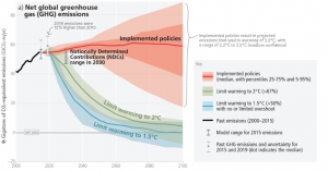
This illustrates the vast gap between the future world we’d prefer to live in and the future world we’re creating based on current actions. The red band shows projected emissions based on implementation of policies at present. Some industries are projected to reach net zero for carbon emissions before others, but reaching net zero for all greenhouse gas emissions (not just carbon) is expected to take longer. Minimising global warming means making big cuts, now, across all sectors.
There is a rapidly narrowing window of opportunity to enable climate resilient development (figure SPM.6)
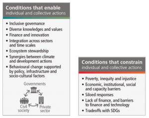
The final figure we have chosen is just part of a more comprehensive graphic that presents different pathways towards – or away from – development. The report defines climate resilient development as “the process of implementing greenhouse gas mitigation and adaptation measures to support sustainable development” and notes that “interacting choices and actions made by diverse government, private sector and civil society actors can advance climate resilient development, shift pathways towards sustainability, and enable lower emissions and adaptation.” In other words, there is a role for everyone. Virtuous pathways can emerge from approaches that promote equity and justice, integrate sectors and actors, respect Indigenous knowledge, and prioritise care for the planet.
Access the Synthesis Report and other materials from the IPCC’s Sixth Assessment here . You can also learn about discussions in the preparation of the Synthesis Report here .
Cover Photo: Robin Nieuwenkamp (Shutterstock)